
HCI
2 interfaces that are frustrating for the user.
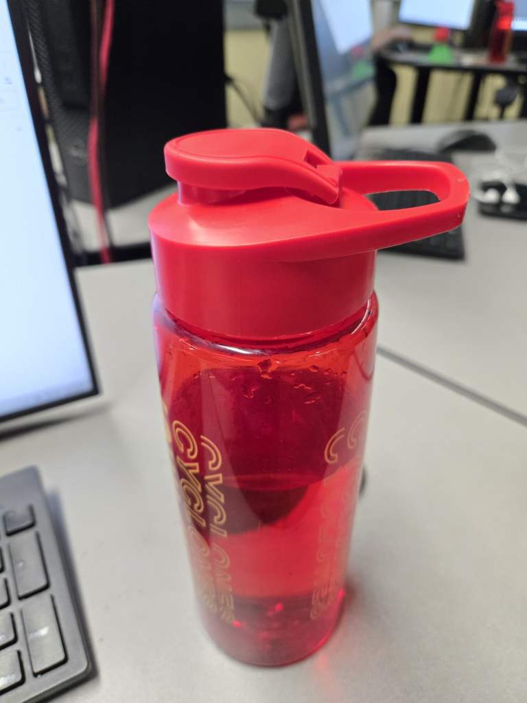
1: This water bottle is frustrating for the user. I like to carry my water bottles around by the handle/hook, but this edge is sharp. it makes it uncomfortable to hold. It would be made better if the handle was smooth and comfortable to hold with a few fingers.
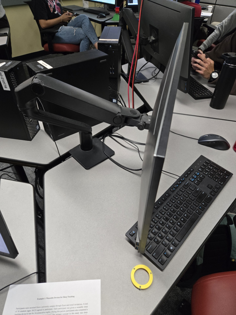
2: This monitor adjust is annoying to use. When I try to adjust my monitor in just one direction, it moves in multiple. If I try to move my screen back, it moves back and right, or back and down, or back, down, right, and tilted. It is also a stiff hinge so it takes some force to move. I mean, its better than not being able to move it at all, but still, bad HCI. Could be made better by allowing only one direction movement at a time, and having smoother movements, easier to push around.
Lol, I love this new kind of blog post topic. One of my past classes required us to critique items that we use or come across often that have bad designs. I think you accurately captured that.
The homework from Intro to HCI 1 may have been inspired by that class 😉
Nice finds! Especially with given that these are both things that you have to use on a regular basis!
I was just about to say the same, David! I remembered our Ethnography class example of how confusing Parking signs can be.