HCI– late night contemplations of bad UI
There have been several bad UI’s that I have encountered. But the worse two are as follows:
-NASA’S website
-Delt Airline’s Phone Application
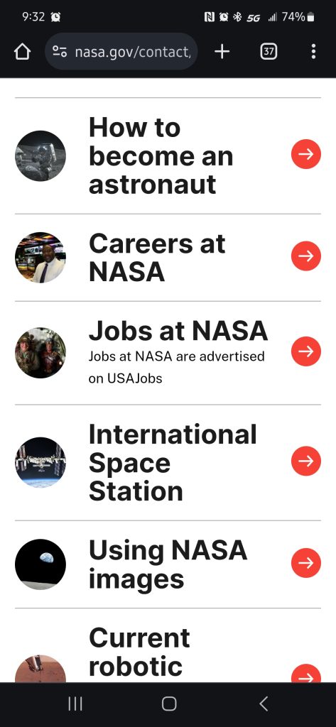
The thing that is awful about the NASA website is that there are layers upon layers upon layers of nested menus which seem to have no end. You get to one page of the site then immediately are presented with a another set of buttons which bring you to even more pages which are sometimes circular. One example is when you scroll to the Contact NASA button and select it. You are then presented with a very odd customer service page, as in, there is no real customer support. Instead it fulfills the duty of an FAQ page. It also lists Careers at NASA as a menu option as well as Jobs at NASA.

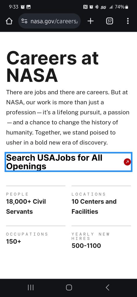
When you select Jobs at NASA you are brought to a different website entitled USAJobs where you can then search for open positions. However if you select Careers you are then faced with the following webpage:

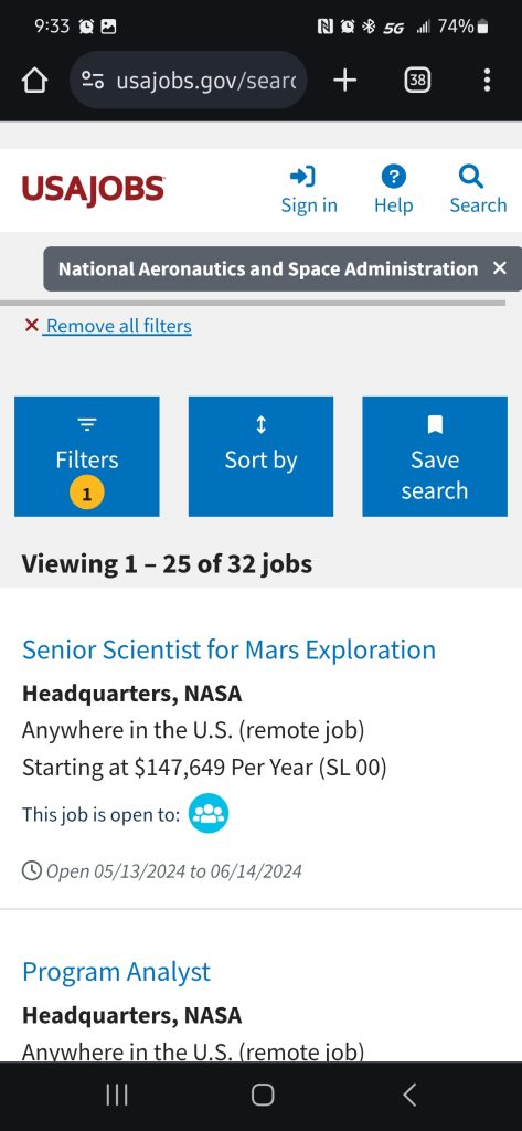
But if you select the button “Search USAJobs for All Openings” you are then brought to the following page:

Which is exactly the same page that the Jobs at NASA link brings you to, but with an extra step to get there. To me this interface is convoluted and unnecessary. You do not need to two buttons for the same purpose, even if one appears to be different than the other. This is a wasted use of menus and makes the night unnecessarily complex to navigate. You stop at the first menu and ask yourself if you want a job or career at NASA, which takes time, and then after deciding on either one you are brought to the same page which made your initial ponderings a waste of time. If they were to simplify their sight, consolidate repetitive information, and remove layers of menus to make the sight more user friendly then the UI of this webpage would be greatly improved and make for a much more enjoyable exploration of the space program.
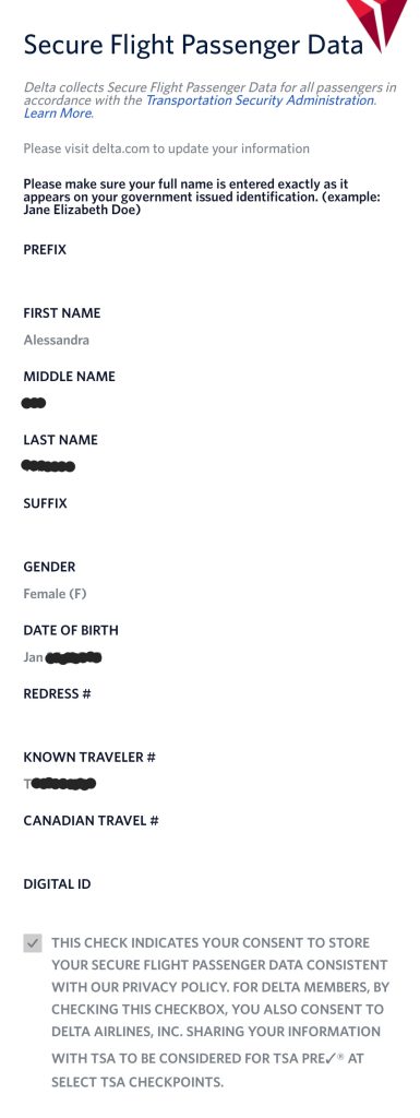
The next poorly designed UI is the Delta Airline’s application for phones. The app in gneeral looks very similar to most other airline based applications (such as United or Southwest), except for this specific page:

The issue with this page is very subtle, but it is at the top. When I first received my TSA precheck number, I needed to add it onto the flights I had booked for both my trip to Houston a few weeks ago as well as the traveling to and from here. My Houston flight had been booked through United Airlines. Their phone application allowed you to enter the settings from the app, input your KTN, and then apply it to your flights. When I received my boarding pass there were no issues and my Precheck was printed correctly. With Delta however, you have to click on a link at the top of the settings page in the application which brings you to a website that you have to log into, then you can change your settings. The KTN number then shows in your application. However, there is no way to “apply” it to your flights or to check if there was an issue with getting it added to your ticket. When I arrived at the airport the very kind lady at the counter informed me (after I had discovered the Precheck had not printed with my boarding pass) that she was unable to add my KTN to my ticket for some unknown reason. The number said it was correct and my name had not been misspelled, but there was an error with the information in the Delta System and it was preventing me from accessing my precheck benefits. The reason I feel that this is poorly designed UI is that because it is such a complex system, having multiple data input and transfer points, that it was easy for it to have an error or failure which prevented the proper data from being transferred the date of the event and no way to check prior to your flight if precheck was going to print. Their UI would be significantly better if you did not have to leave the app to input any data, if there was a way to “apply” the data to your fights, and if there was a way to check to see if there were any issues with the data or the flight information which may prevent it from being added to your ticket prior to your departure date so you have time to rectify the problem.
Thank you for taking the time out of your busy schedule to read my TSA Precheck annoyed ramblings. Live long and prosper.

Comments
HCI– late night contemplations of bad UI — No Comments
HTML tags allowed in your comment: <a href="" title=""> <abbr title=""> <acronym title=""> <b> <blockquote cite=""> <cite> <code> <del datetime=""> <em> <i> <q cite=""> <s> <strike> <strong>