HCI – What Netflix and Nintendo have done wrong.
There are many products in the world that we enjoy using and some that we may have a distaste for. Below are two products that fit somewhere in the middle for me. I enjoy using these products, yet they have a major room for improvement in their user interface department.
Netflix is a wonderful streaming service yet there is one noticeable flaw on its platform. This flaw is the autoplay feature. If you are browsing for a new show, it is better to skim over the short description to gauge interest. Instead, Netflix’s idea was to have a trailer play along with the description whenever the user hovers the mouse over a title for more than a fraction of a second. Because I do not want to see trailers, I find myself avoiding covers of movies and shows that just seem uninteresting without even reading the descriptions. I occasionally will navigate through the shows carefully while trying not to touch any with my mouse. Netflix should remove this autoplay feature immediately and go to using descriptions. Maybe there are some people out there who enjoy autoplay but it would be doable with the ability to toggle a simple switch in settings. Despite this horrendous feature, I do appreciate the fact that users are able to mute the trailers. Netflix is extremely successful and I enjoy some of the shows and movies on Netflix a lot, but getting rid of this feature would allow me to have an enjoyable time on the interface as well. If a description really piqued my interest, I could look the trailer up on youtube. I already do that with movies anyway. If someone actually enjoys the autoplay feature, feel free to reply because I have to understand why and how they deal with it.

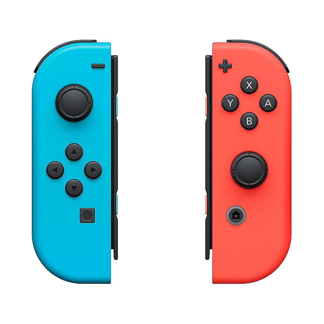
I also have beef with Nintendo. The second product I have a hard time dealing with are Nintendo Switch Joy-Cons. When someone is playing a video game on a nintendo switch with the Joy-Cons attached, it allows the user to play on a controller feeling setting with a screen in the middle. This functionality works and I have no complaints. My complaint is when two people are trying to play one game and each person has to use one Joy-Con. One person will get the Joy-Con on which the joystick and buttons are skewed to the left and the other will get the one where they are skewed to the right. Both are uncomfortable and more difficult for use. This is why most users will then buy a pro controller to give the actual gaming console feel if they do not want to use Joy-Cons. My solution for the Joy-Cons is to be able to move and lock either the buttons on the left Joy-Con or the joystick on the right Joy-Con. This slider would allow the Joy-Cons to lock into a comfortable centered position for their individual use or return to normal when using both at once. This would allow both Joy-Cons to have the joystick on the left and the buttons on the right of each Joy-Con so that the user is playing with their controls centered on the Joy-Con. This would allow for easier gameplay and less fighting over who gets the right or left Joy-Con. If you look at the picture below, you can clearly see what I mean.


Comments
HCI – What Netflix and Nintendo have done wrong. — No Comments
HTML tags allowed in your comment: <a href="" title=""> <abbr title=""> <acronym title=""> <b> <blockquote cite=""> <cite> <code> <del datetime=""> <em> <i> <q cite=""> <s> <strike> <strong>