HCI: Interfaces to Improve
Here are two interfaces that I believe need to be improved upon.
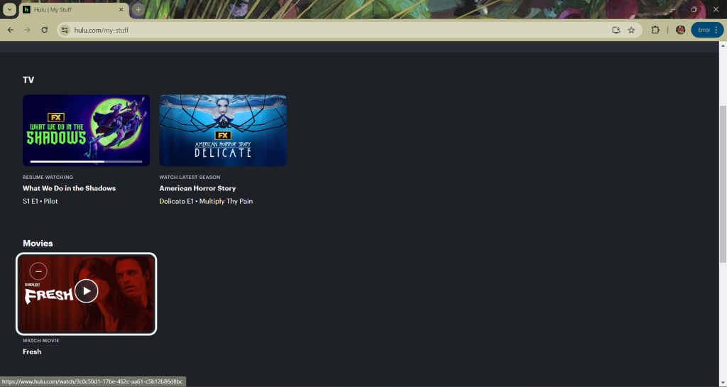
1) Hulu My List: One feature that Hulu offers is the “My List” feature. This lets the user add content to the list so that they can come back and watch the show/movie without having to rely on memory. I think that this page is well designed visually; I like the rounded shapes and hierarchy created with different fonts, weights, and brightness. I also like how the preview image for the show is highlighted when you hover over it. The part that I believe needs to be improved upon is the more info link. In other streaming services, they have a clear button to let you know how to access more information about the show. In this area of Hulu, the user is supposed to click on the title of the show to gain more info. However, there is no signifier that lets the user know that is what they have to do. When you hover over the image, the title doesn’t change to let you know it is clickable. When you hover over the title, the only thing that lets you know you can click on the title is that the cursor changes shape. Additionally, with such a small font size for the title, it is less likely that the user will stumble across the clickable title on accident. To make this better, I think that there should either be a button on the image, similar to the play button, or the title should underline when the user hovers over any area of the showcard.

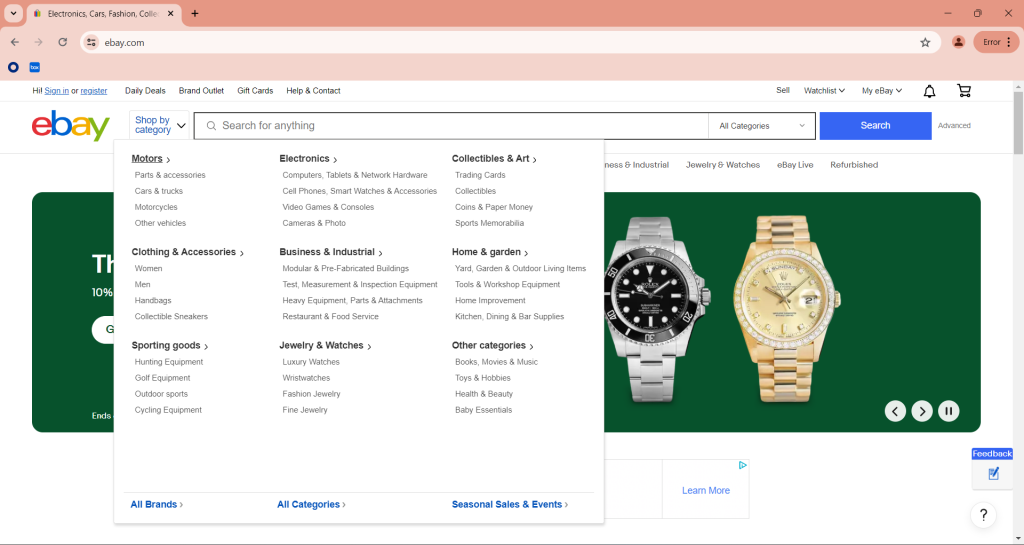
2) Ebay Shop by Categories: This feature on Ebay allows users to browse items by specific categories. When the user clicks on the “Shop by category” button, this dropdown menu opens. I like that there is some visual hierarchy with the bolded text on the broad categories and normal text for the detailed categories. I also like how there is an arrow next to the broad categories, which lets the user know that they can click on them to get to another page. However, I think that this dropdown menu has too many options. With the broad and specific categories, there are over 45 options on this single dropdown. I think it would be more effective if only the broad categories were showing at first, and the specific categories show when the broad category is interacted with. This way, the user is not overwhelmed with options and they can get to the category they need easier.


Comments
HCI: Interfaces to Improve — No Comments
HTML tags allowed in your comment: <a href="" title=""> <abbr title=""> <acronym title=""> <b> <blockquote cite=""> <cite> <code> <del datetime=""> <em> <i> <q cite=""> <s> <strike> <strong>