In this week’s workshops, we started learning different CAD (Computer-aided design) software, exploring applications like Solidworks and Blender. For many of us, it was a completely new experience, and the learning curve proved to be quite steep. Personally, I hadn’t interacted with this type of software since my freshman year in high school, and it reaffirmed my decision of not majoring in engineering in college.
On Monday, we embarked on a crash course in Solidworks, which truly lived up to its name. The tutorial provided a basic understanding of the software’s interface and functions, but it fell short when it came to explaining the purpose behind each action. As I attempted to create a candlestick model, I made a mistake with an arc, resulting in the entire design being messed up. It was only then that I realized the importance of precise measurements in such a software.
Moving on to the next CAD software, Blender, I hoped for a smoother experience, but unfortunately, it didn’t prove to be any better. Our initial lesson involved manipulating a sphere to sculpt a cat, adjusting different planes to form the ears, eyes, nose, and mouth. However, we were abruptly thrown into the deep end with the next task of creating an entire garden scene, which proved to be a substantial leap forward and an even steeper learning curve than the hills of southern Warren County.
I hope that on Friday, we receive more detailed instructions and guidance to navigate these challenging workshops. At the moment, it feels as if we have been forced into the deep end without sufficient support or preparation.
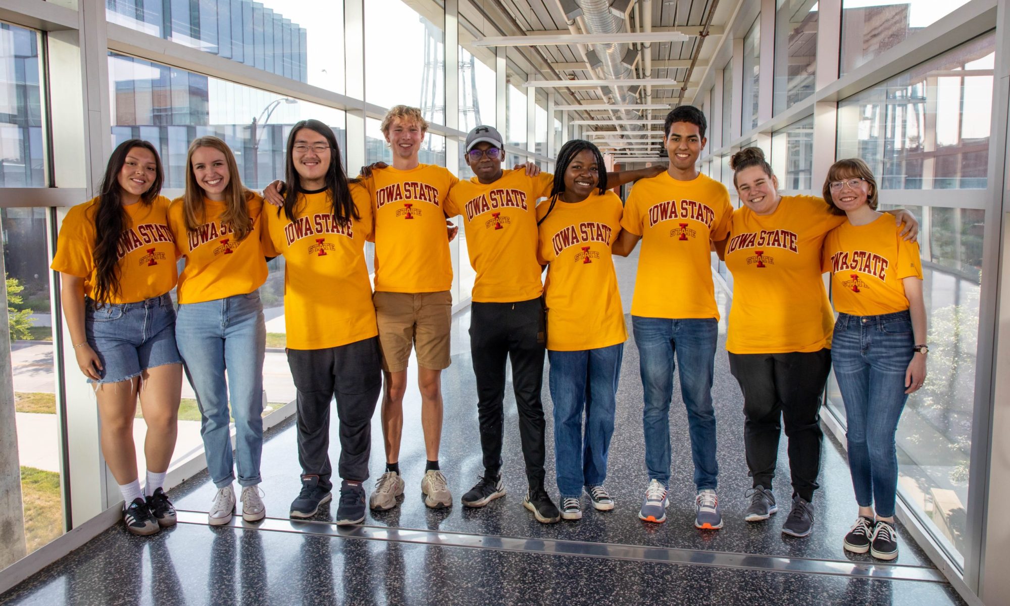
We’ve had great success brainstorming a t-shirt design for this year’s program. With nine of us in the program, we decided to go with the “VRAC” bunch theme, inspired by the 70s show, The Brady Bunch. Kris drew portraits of each of us, which we’ll arrange in a grid on the back of the shirt, similar to the show’s format. The design is already much cooler than last year’s, and we’re all excited to create a t-shirt that we’ll proudly wear instead of hiding it in our closets.
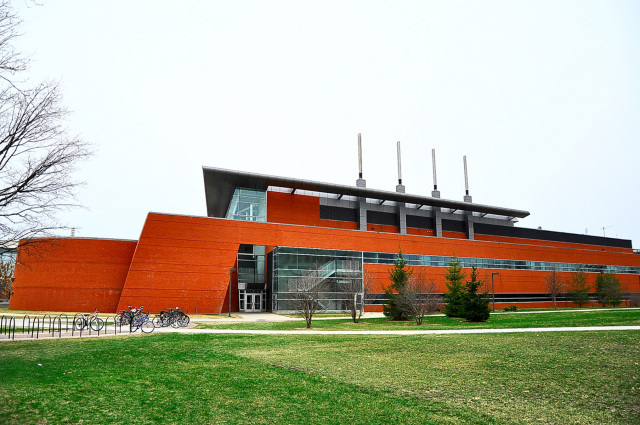
Finally, I had a conversation with an aerospace engineer who regularly attends classes in Howe Hall. He told me a cool story about how it was constructed: the building was actually designed to resemble a ship, specifically the Titanic. Intrigued by his words, I decided to investigate further, and to my surprise, I could clearly see the resemblance he was referring to. However, it seems that the other interns lack the imagination or keen observation skills to perceive this similarity. To help them understand, I prepared a helpful visual comparison to bridge the gaps in their perception.

Homework
This is for the Intro to HCI post lesson homework. Yes we have homework during the summer but I swear its not that bad. Our assignment was to find two interfaces that are difficult for the user to operate and find what doesn’t work, what does work and what we would do to make it better.
First, I think the ISU-issued wallets and keys are unnecessarily complicated and cluttered. In our current setup, we have a single wallet that contains multiple cards: a Student ID, an apartment card, a meal plan card, and a key to access our apartment after 8:00 pm. Although these cards serve different functions, they essentially accomplish the same goal.
At Dakota State University, on the other hand, they have streamlined the process by integrating all these functions into a single ID card. Additionally, they have even taken it a step further by introducing the option to activate the ID on your phone, allowing you to perform all the necessary tasks conveniently.
While I understand that ISU may not specialize in technology (tongue-in-cheek), implementing similar technologies would significantly reduce the clutter and complexity associated with managing multiple cards and keys.
2.
Furthermore, I have a strong dislike for the design of our kitchen in the apartment. One particular issue is the placement of the small garbage can, which can only fit in the narrow space between the kitchen nook and the dishwasher. This arrangement creates a major problem: whenever someone is loading or unloading the dishwasher, it becomes a challenge to maneuver around the garbage can, often resulting in spilled garbage and a messy situation.
To address this problem, a simple and effective solution would be to incorporate a garbage drawer within the kitchen. By having a designated drawer that can be easily opened and closed, we can maximize the limited space while ensuring an efficient and convenient trash disposal system within the kitchen area. This adjustment would greatly enhance the functionality and usability of the kitchen while eliminating the hassle and potential mess caused by the current setup.
Excellent bad-usability examples! I especially like them because they’re not just web sites or mobile apps–they’re real-world body-scale issues. So much of HCI is larger than software.