
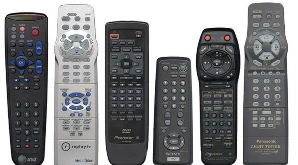
- TV Remote Control Interface:
- User’s Task and Context- The user wants to navigate through channels, adjust volume, and access various features on a TV using the remote control.
- What’s Working/Not Working: The remote control has a complex layout with numerous buttons, making it challenging for users to locate specific functions. The absence of clear icons or intuitive labeling further adds to the frustration. There hasn’t been a single time that these controllers get me what I want without pressing the wrong button.
- Improvement Suggestions: Simplifying the remote control layout by removing unnecessary buttons and grouping related functions together would make it more user-friendly. Implementing visual indicators or on-screen instructions to help users understand the button’s purpose would also enhance the experience.
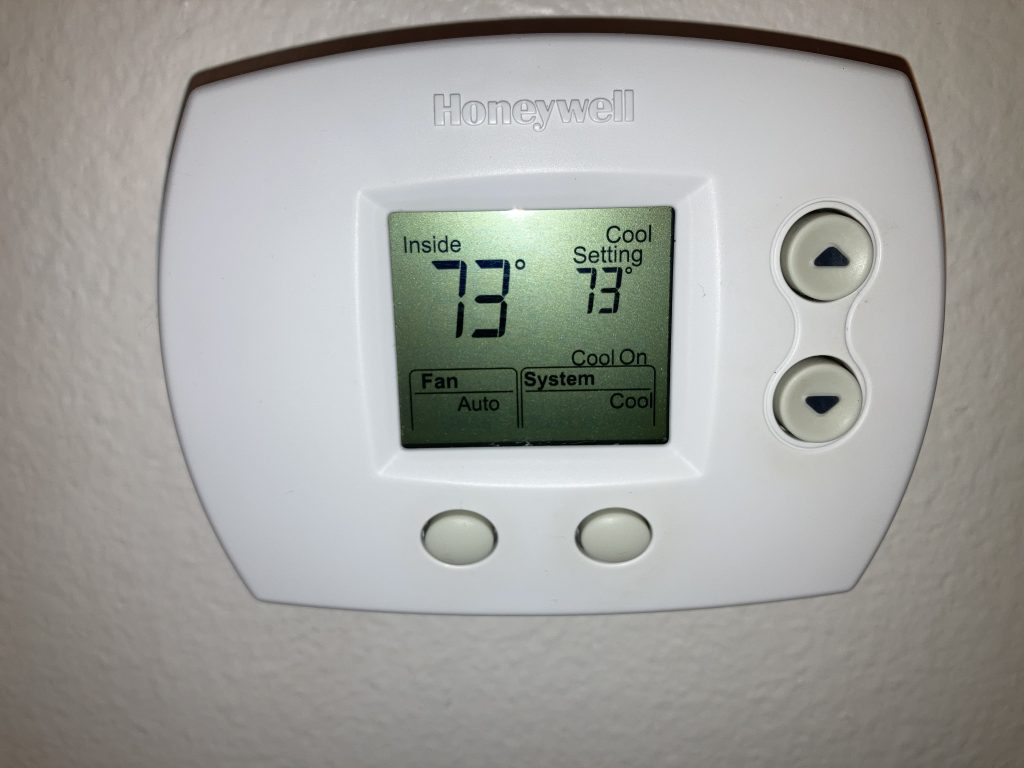
2. Honeywell Thermostat:
User’s Task and Context- The user wants to control the temperature and settings of the thermostat.
What’s Working/Not Working- The Honeywell thermostat interface can be frustrating for users due to several reasons. Firstly, the interface lacks intuitive icons or clear labeling, making it difficult for users to identify and understand the various functions and settings.
Secondly, the menu structure and navigation are confusing. The organization of the menus and submenus does not follow a logical flow, leading to difficulty in locating specific options. Users may need to navigate through multiple layers of menus, which can be time-consuming and frustrating.
Additionally, the feedback provided by the interface is non-existent. For example, when adjusting the temperature, there is no clear indication of whether I can use the heater or AC. This lack of real-time feedback can make it challenging for users to determine if their changes are having the desired effect.
Improvement Suggestions: To make the Honeywell AC controller interface more user-friendly, several improvements can be implemented.
Clear Icons and Labeling: Incorporate intuitive icons and labels that represent different functions and settings on the controller. This would make it easier for users to identify and understand the purpose of each button or option without relying heavily on the user manual. Streamlined Menu Structure: Redesign the menu structure to follow a logical flow, ensuring that commonly used options are easily accessible. Minimize the number of submenus and simplify the navigation process to reduce user frustration. Real-time Feedback: Provide users with real-time feedback on the current temperature and the mode (heating or cooling) the thermostat is operating in. Clear visual indicators or text on the thermostat’s display can inform users of the current mode and the impact of their temperature adjustments. This feedback would allow users to make informed decisions and understand whether their changes are aligning with their heating or cooling preferences.
Excellent write ups! I appreciated your structure with user’s task/context/goal and improvement suggestions. Nice work!