
An easy example of something that’s not working is the front door to the VRAC.
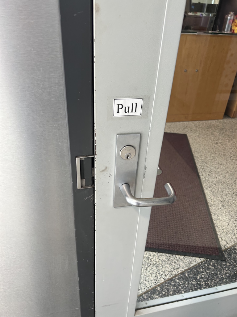
Anytime a door has to have a label, that’s generally a sign it’s not good. This door looks like you should have to turn the handle to open it, when you actually should just pull. If the door’s handle were a bar (like the one on the JB conference room), this would indicate to the user that you should pull on the door and the task would be clearer.
Another example of UX that I personally don’t like is Snapchat’s new placement of the back button. I feel like the arrow is facing the wrong direction. Snapchat chose to implement this back button to get the user from an individual chat back to the home screen, but the direction the arrow is facing conflicts with the way the swipe animation works, and disorients the user. Snapchat could fix this by changing the direction the arrow is facing and possibly placing it on the other side. This goes against our traditional conventions of what direction a back arrow should be, but I’m not sure what a better solution would be. This matters mostly because of the directional aspect of the user interface of Snapchat, since it is different than a website.
I tried to insert a video, but it didn’t work. Basically it looks like this arrow should lead to a new page animated to the left of the current page, but it actually navigates back to the right.
Good examples. I like your point that if someone has to add a sign, there’s a problem. https://images.app.goo.gl/vTfsjXYHBdSg2AV46