
This is the second post of a two-part series about interfaces with that are frustrating for the user.
Another frustrating interface that I am encountering is the stove knobs in my apartment.
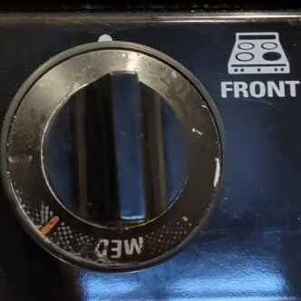
Although there is no indication, one can turn the knob from this initial off position in both directions. Furthermore, note that it is not immediately visible how which positions are for high and low heat.
Upon looking in detail, you can see that clockwise from the “MED” indicator, there is a red line, while counterclockwise, there is a very faint white line. This would suggest that you can set the knobs in these positions to create high and low heat respectively. Yet this is not obvious at all, since the indicators are faded.
To make clear the correct knob positions, the manufacturer should consider the long lifespan of household appliances and take account this lifespan while designing the markings. For example, instead of printing the markings on the high-touch knob surface, it can be printed on the surface behind the knob, which is touched less often and therefore be less susceptible to wear. Then, the long handle of the knob can align with the markings behind it. An even better way would be to emboss the markings so they last even longer.
Nice ideas re the longer lasting markings and considering how people usage of the device affect its long term viability.